
I can admit, before I went to the wonderful Maria Killam's True Colour Expert workshop, I didn't know much about color. I liked color, I used color (not always right), and I noticed color... but I didn't have confidence in why it worked to use one versus another.

At the workshop, one (major) concept we learned about was the difference in clean and dirty colors. I remember reading Maria's blog posts at Colour Me Happy over and over, trying to understand it.
I didn't.
To solve that problem, I took a little jaunt over to Vancouver and attended the workshop.

While I sat in class and filled my brain full of information, I kept thinking about how wrong a few colors in my home were... and how my husband would wish that I never attended after I told him we needed to repaint almost, well, everything.

One of the colors that I knew was wrong was an accent wall in my living room. (If you read my earlier post about accent walls, don't be fooled, I am not completely against them!)
The living room is very nuetral with pops of bright blue, green, and turquoise.
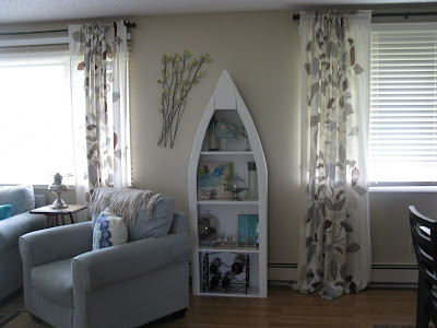
To tie in the bright blue accents, I painted an accent wall a wonderful blue from a piece of art in the room. Bad idea. It wasn't wonderful on the wall.
So I repainted it with a different shade. Better, but still not great.
The living room is very nuetral with pops of bright blue, green, and turquoise.


To tie in the bright blue accents, I painted an accent wall a wonderful blue from a piece of art in the room. Bad idea. It wasn't wonderful on the wall.
So I repainted it with a different shade. Better, but still not great.
There was just something about it I didn't like. Too bright? Too blue? I didn't know and wasn't willing to keep repainting it.
BEFORE:
 |
| Before. It really wasn't this bright in real life. Camera flashes + horrible photographers = SUCKY photos. |
 |
| Before. No flash. |
During the True Colour Expert Workshop, I sat in that classroom and realized why I didn't the color I had blindly chosen. It was way too CLEAN for the room. It screamed 'kids room' and made everything else look dirty. All I did was find a DIRTY blue that was already used in the room and repainted.
AFTER:
 |
| After. The dirtied version of blue. |

Better, don't you think?
Before
 | ||
After
|

The best part? My husband didn't even notice.
And if I didn't tell him I repainted, he still wouldn't notice.
Now... all I have to do is replace my coffee table, paint the other walls, install baseboards, replace all the lighting, find a new lam.. (K, I'll stop now)
Linking up to...
If you need assistance with your own clean and dirty (home interior) issues, email me at coleyhueske@hotmail.com
24 comments:
Wow - MAJOR difference - it looks amazing! Great Job! If it makes you feel any better - my husband wouldn't notice either! (i bet he would notice if I moved the snack cupboard though!) :-) xoxo from Trinidad
Much better Coley! I had no idea there were clean and dirty colors! I'll have to pay more attention when picking out paint colors :)
Hey, thanks for checking out my blog! Your transforms are great also! Funny about your husband..men! Just subscribed friend connect!
Wow! This whole concept of clean and dirty color is a new one for me. I need to learn more! Love the new color....and you are so right about husbands not noticing stuff LOL
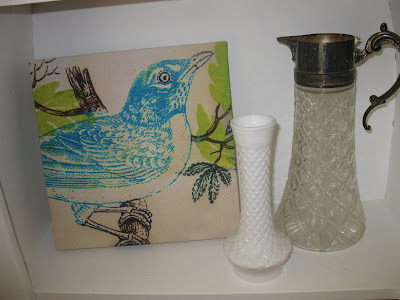
lol! I love how you wrote this post,Coley! My husband won't notice it either.... Love the transformation... what a difference shades of color can make! Even the shelf looks as if it went through a beautiful transformation with the dirty blue as a backdrop... lovely post! Thanks for sharing and for your sweet comment on my garden.Have a great weekend!~Poppy
http://withadashofcolor.blogspot.com/
Oh wow! I have never thought about that! But I do love your new color! Not as bright and I think looks better now that there is a before and after! Cool! What class was that?! Your follower thing disappeared but I'm going to try and follow! :)
Ashley Sloan
i think it is much better! sounds like a very interesting class thanks for sharing what you been learning
LOVE the "after" blue. Great job!
Love the new color! I have never heard of this concept before, but obviously I need to do some more research. Thanks for pointing me in the right direction!
Looks so much better! I'll be honest I didn't really get it before but this post made the dirty vs clean idea 'click'. Thanks so much for sharing!
This is such a brilliant concept...I think you just changed the way that I look at colors! (c:
Wow! That is makes such a huge difference! Love it!!
Becca
http://blondeslogic.blogspot.com
Interesting. I have seen the before and thought it was beautiful. I liked it. Now seeing the after picture, it does make a difference. It actually brightened up accent pieces. Nice.
Love the new blue! Blues are hard to work with and I'm a blue and white gal. Thanks for popping in for a visit at TheDedicatedHouse. Nice getting to know all the great ladies out there! Tootles, Kathryn
Love that repaint.
I don't know about the usage of terms dirty and clean, but I've learned a heck of a lot about color from mixing my own paint in the last few months. Almost every shade I use has gray or taupe added into it--which I'm guessing is at the core of dirty?
Much better! I totally see where you are coming from. And I think this helps solve a lot of my color problems. Can the same thing be applied to darker colors though? It's easy to see if lighter color is "dirty" but not so much a darker one.
wowee! that looks waaaaaay better!! ties in much nicer and keeps the room feeling calm and serene!
thanks for stopping by the other day!
Definitely better! :) It really does make a difference...looks awesome with your accents in the room! Great job!
My question has nothing to do with clean and dirty colors, although that is very enlightening :). Where did the shelf on the wall come from?!
Coley, how did I miss this wonderful post! Thank you, and I love the transformation, so beautiful!!
I'll post it on facebook and twitter next!
Love it!
x
Maria
such a difference! LOVE the after, great job. Maria's class was worth it for sure!
It looks amazing. Definitely better after! :)
Thanks for stopping by my blog!
*Cappuccino and Fashion*
I really like the designs of Paul Asadov Design & Buy for example, here is this magnificent bedroom - http://www.paulasadov.com/master-bedroom
At Unleashed Painting, we can help you choose the perfect color and design for your Accent walls. We will also carefully prepare the wall before painting it to ensure that the finished product is flawless.
Post a Comment